Ever walked into a bedroom and thought, “Wow, this feels different”?
Nine times out of ten, a smartly chosen accent wall does the magic.
I’ve played with more bedroom paint colors than I’ll admit in public, and trust me—the right shade can totally change how your space feels. Let’s talk about the best paint colors for bedroom accent walls, minus the boring design jargon and plus some real-life, friend-to-friend advice.
1. Deep Navy Blue
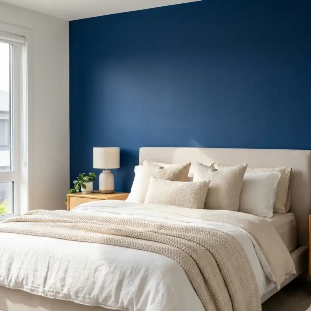
Navy blue brings instant calm, but it still feels rich and stylish. I love how it creates that cozy, hotel-suite vibe without trying too hard.
This color works especially well behind the bed. It frames the space and makes light bedding pop beautifully.
Why it works so well:
- Adds depth without shrinking the room
- Pairs easily with white, cream, and wood tones
- Feels timeless, not trendy
Ever noticed how navy always feels expensive? That’s not an accident.
2. Soft Sage Green
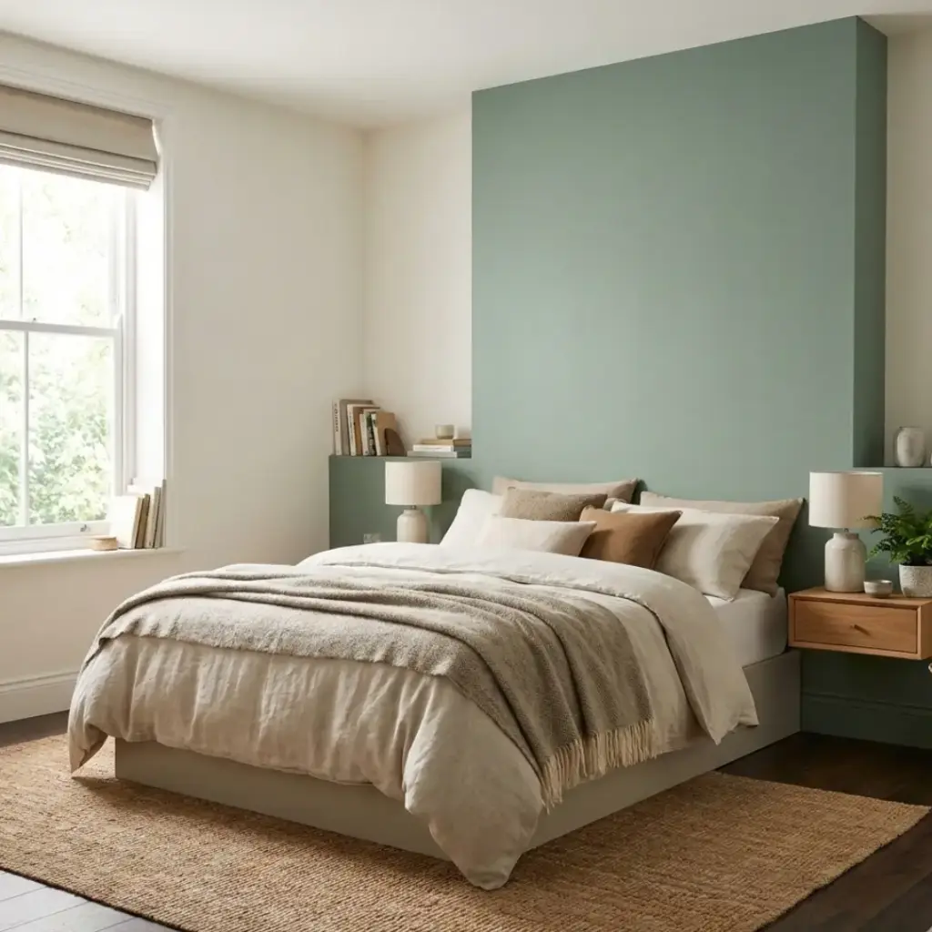
Sage green feels like a deep breath after a long day. It brings in nature without screaming “I love plants.”
I once used this shade in a small bedroom, and the room instantly felt brighter and calmer. IMO, it’s one of the most underrated bedroom accent wall paint colors.
Top benefits:
- Creates a relaxing, spa-like mood
- Works with both warm and cool décor
- Never feels overpowering
Who doesn’t want their bedroom to feel like a mini-retreat?
3. Charcoal Gray
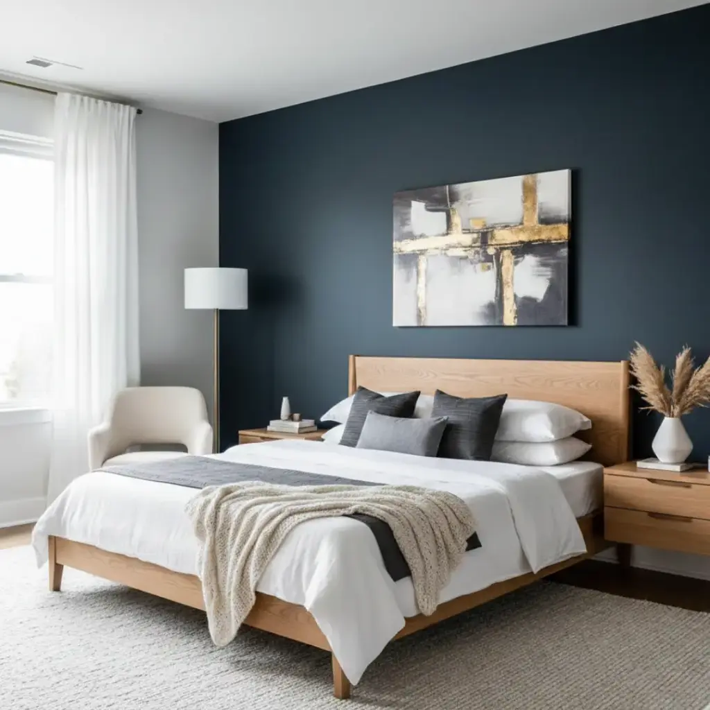
Charcoal gray gives you drama without going full black. I reach for this color when I want something bold but still classy.
It pairs beautifully with metallics, light woods, and crisp whites. The contrast looks clean and modern, not heavy.
Why people love it:
- Adds sophistication instantly
- Works in both large and small bedrooms
- Highlights artwork and headboards
Ever wanted a moody look that still feels safe? This is your color.
4. Warm Terracotta
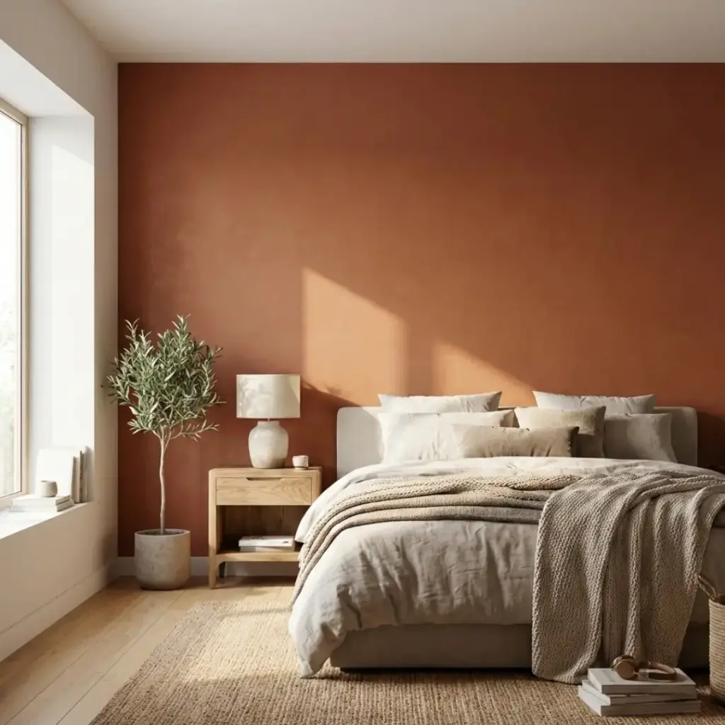
Terracotta brings warmth, personality, and a hint of Mediterranean charm. It feels earthy, inviting, and very human.
I used this in a guest room once, and everyone commented on how “comfortable” the space felt. That’s not random.
What makes it special:
- Adds warmth without darkness
- Pairs well with neutrals and natural textures
- Feels trendy but timeless
FYI, this shade looks even better in natural light.
5. Dusty Blush Pink
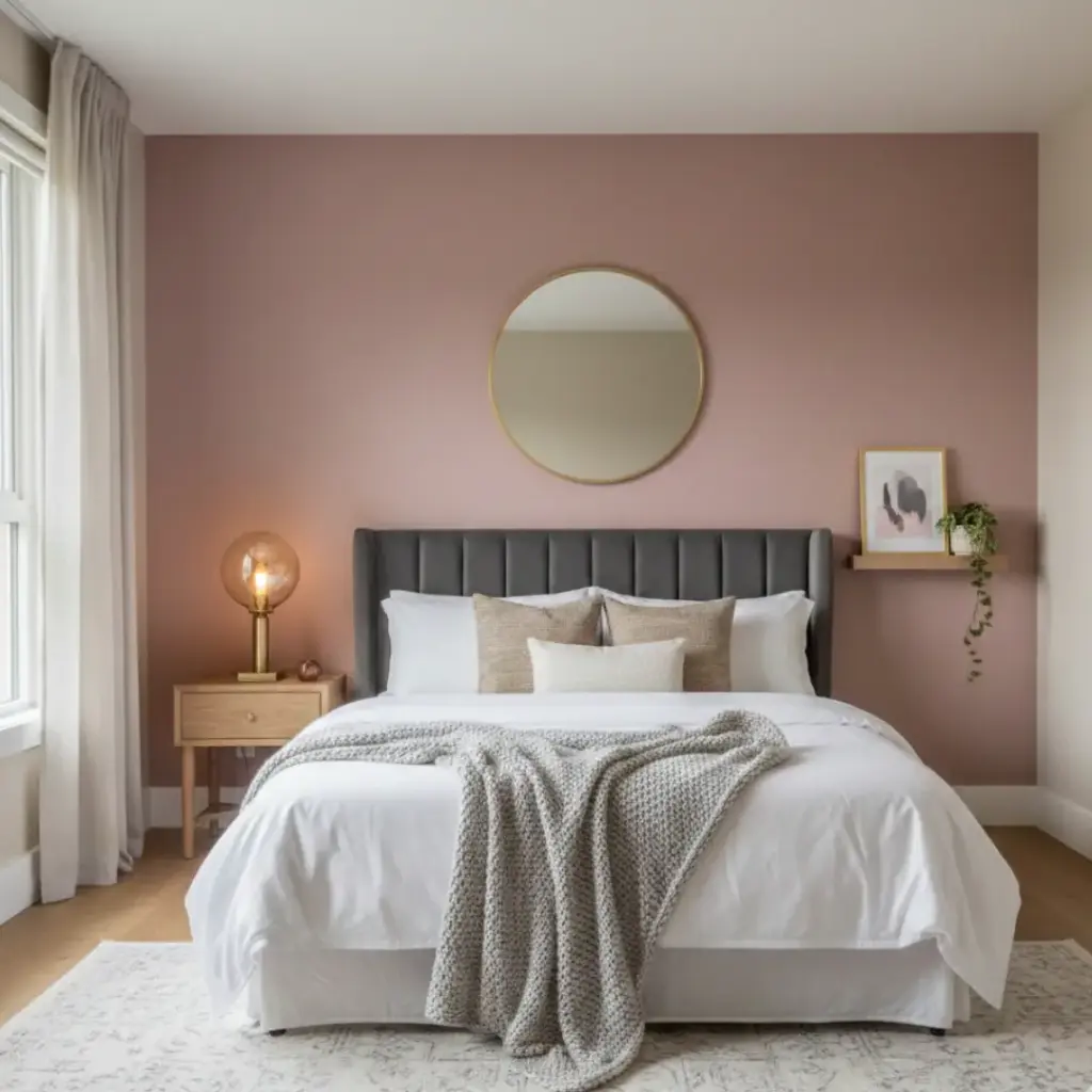
Blush pink doesn’t have to feel sugary or childish. The dusty versions feel soft, grown-up, and surprisingly calming.
I love this color for bedrooms that need a little warmth but not a lot of drama.
Key advantages:
- Softens the room instantly
- Works beautifully with gray, beige, and gold accents
- Feels cozy, not loud
Ever thought pink could feel sophisticated? Now you know.
6. Muted Teal
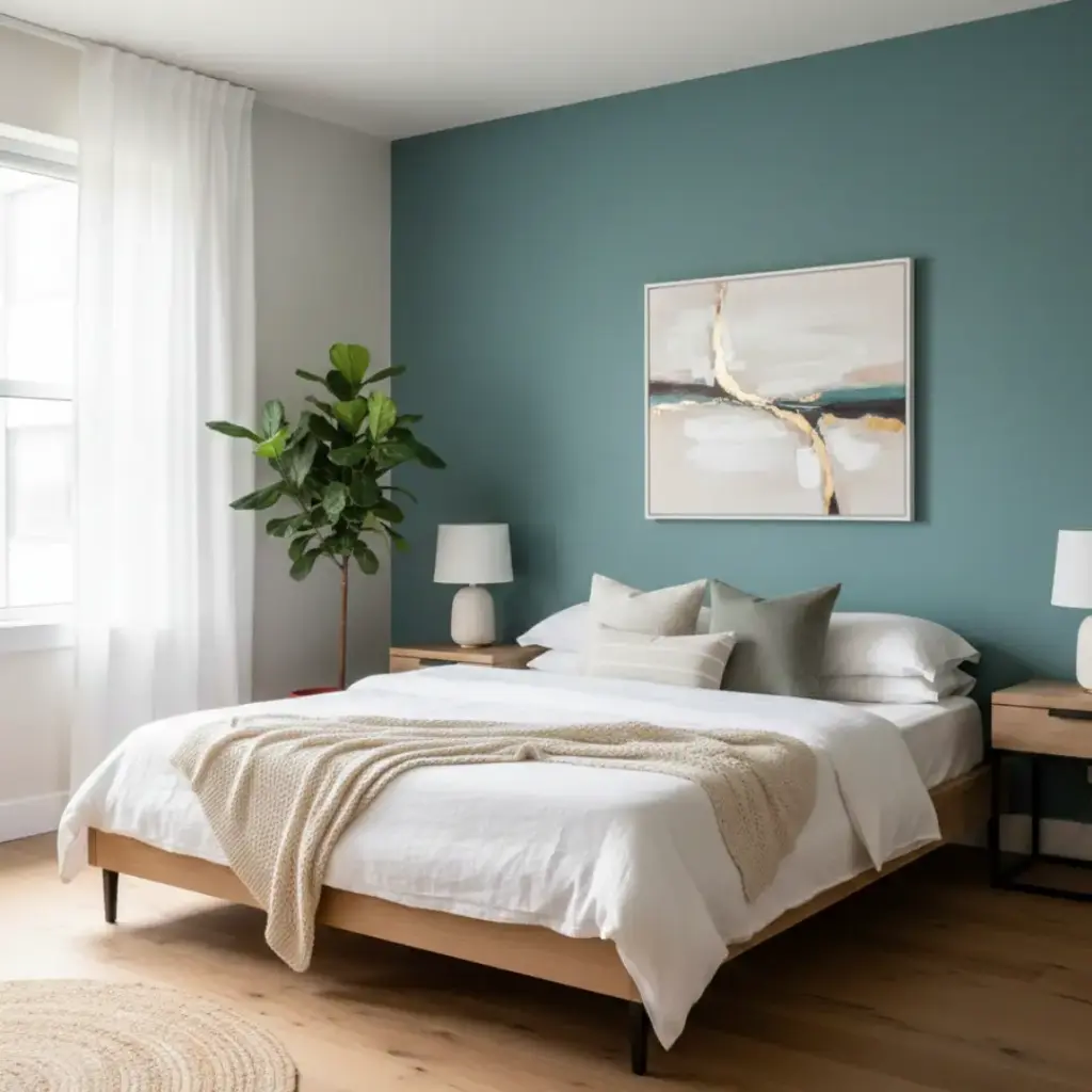
Teal sits right between blue and green, and that balance feels just right in a bedroom.
This color adds personality without overwhelming the space. I’ve used it in both modern and classic rooms, and it always works.
Why it’s a winner:
- Feels fresh but not trendy
- Adds color without chaos
- Looks great with wood and neutral décor
Want color without commitment? Teal has your back.
7. Creamy Off-White
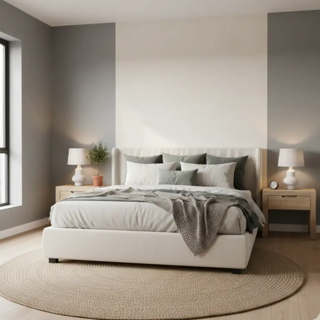
Yes, white can be an accent color—if you choose the right one. Creamy off-white adds brightness without looking flat.
I use this when a room feels dark but I still want definition.
Why this works:
- Reflects light beautifully
- Keeps the room feeling open
- Adds subtle contrast against other walls
Sometimes, quiet colors make the loudest statement. Funny how that works, right?
8. Smoky Lavender
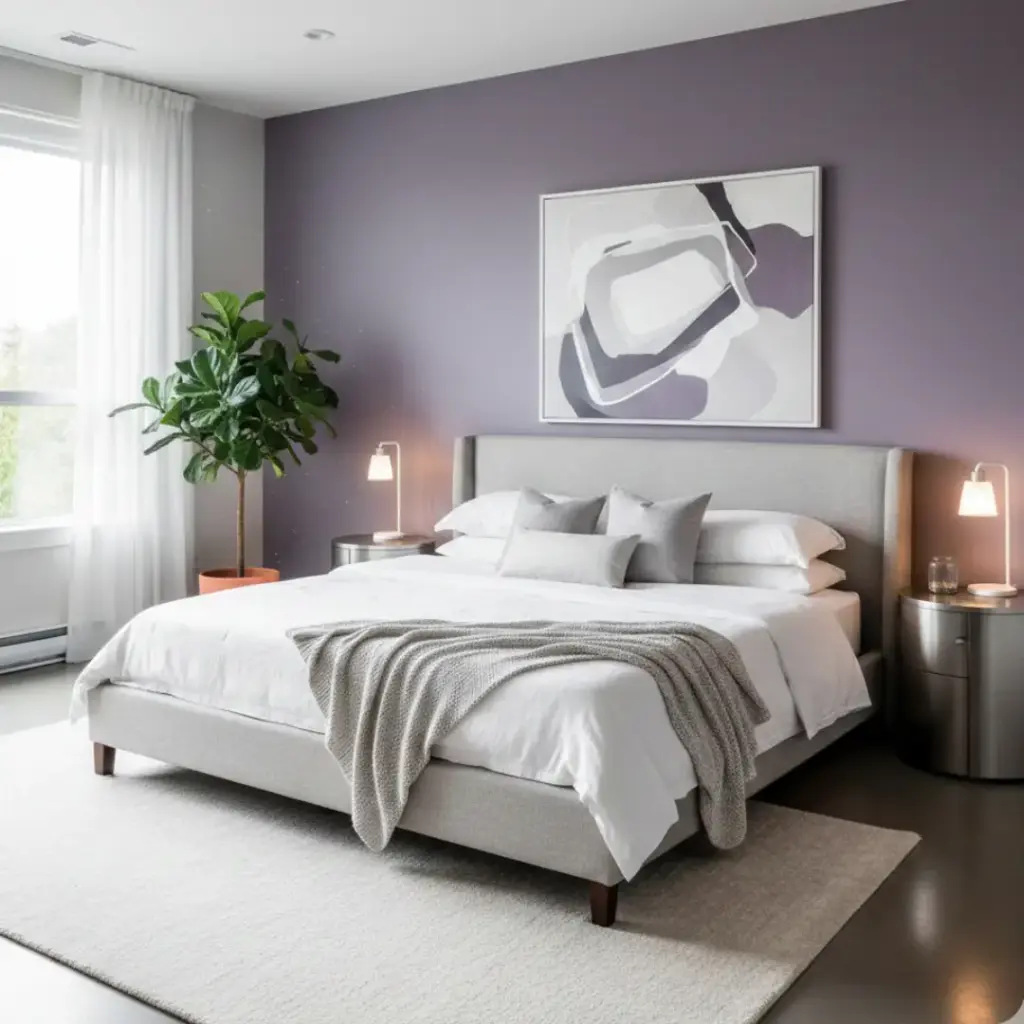
Lavender often scares people, but smoky versions feel calm and elegant.
This shade works great if you want something different without going bold. It adds softness and character at the same time.
Why you’ll love it:
- Feels relaxing and romantic
- Works with gray, white, and silver accents
- Adds personality without overpowering
Ever wanted a color that feels unique but safe? This is it.
9. Chocolate Brown
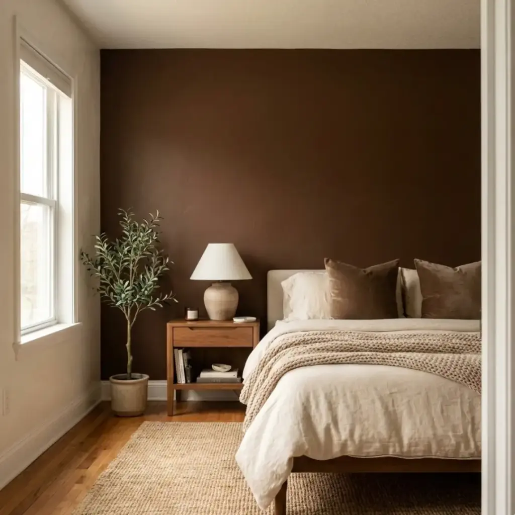
Brown doesn’t get enough love, and that’s a shame.
Chocolate tones feel rich, grounded, and incredibly cozy. I use this when I want the room to feel warm and intimate.
Benefits include:
- Adds depth and comfort
- Pairs beautifully with cream and beige
- Creates a cocoon-like feeling
Who said dark can’t feel comforting?
10. Cool Steel Blue
Steel blue feels clean, modern, and calm all at once.
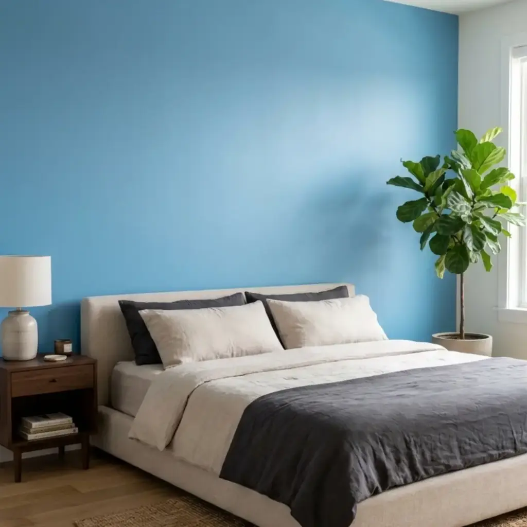
It works especially well in contemporary bedrooms or minimalist spaces. I find it incredibly easy to decorate around.
Why it stands out:
- Feels cool and relaxing
- Works with both light and dark furniture
- Keeps the space feeling fresh
Ever noticed how some blues calm you instantly? This is one of them.
11. Olive Green
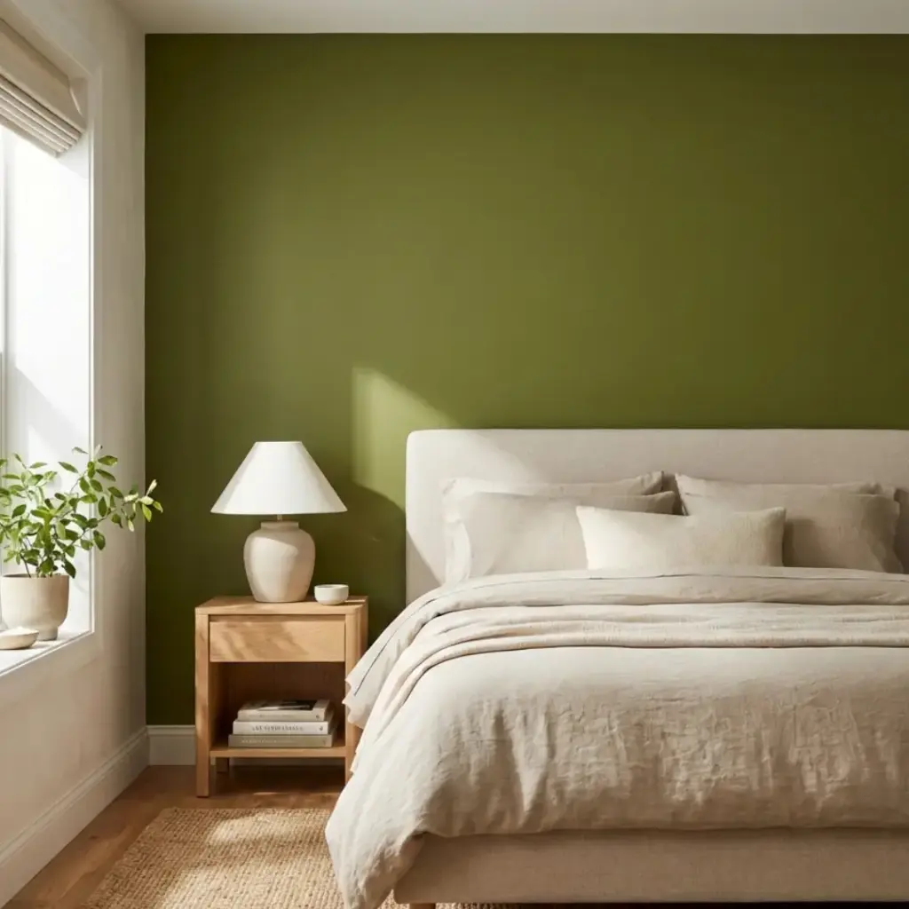
Olive brings depth without heaviness. It feels earthy, mature, and stylish.
I love how this shade connects indoor spaces with outdoor vibes.
What makes olive great:
- Adds warmth and richness
- Works well with wood and neutral textiles
- Feels grounded and natural
Want a color that feels strong but soothing? Olive nails it.
12. Burnt Orange
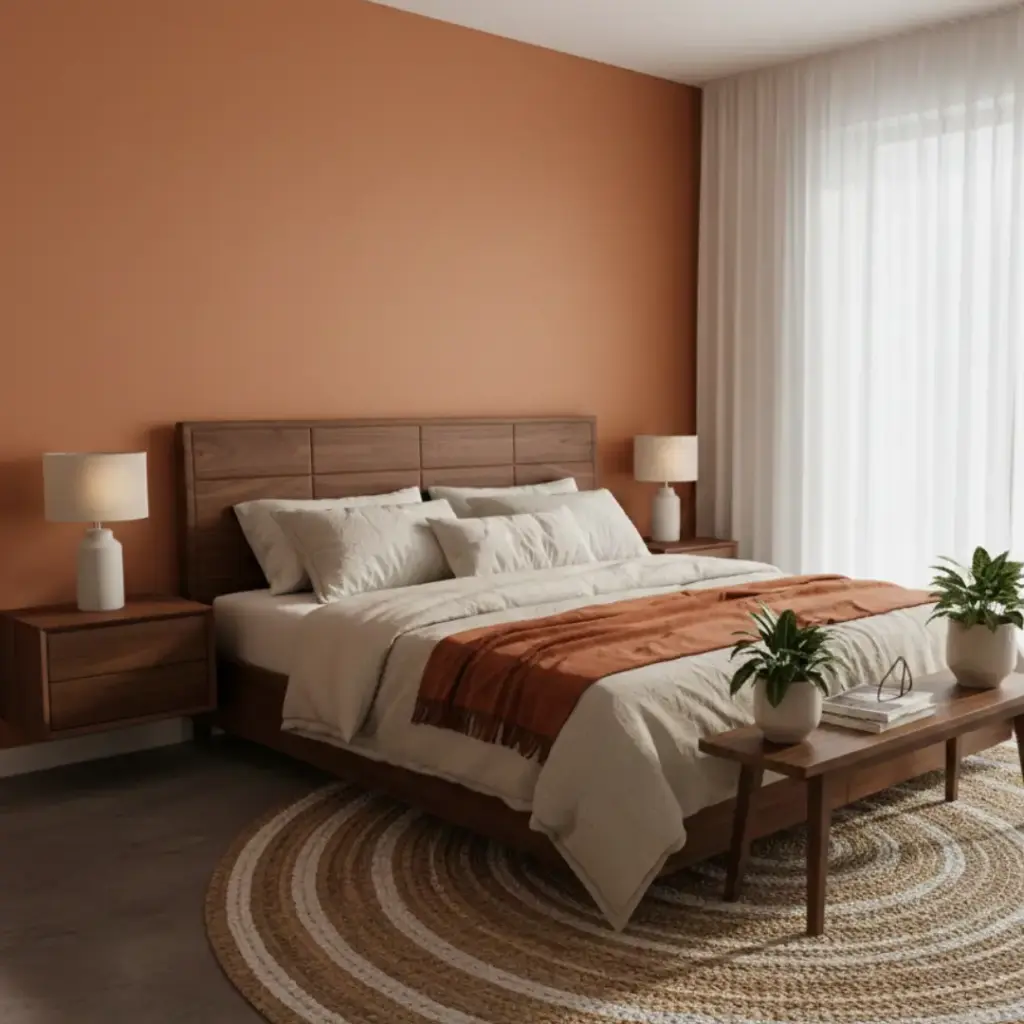
Burnt orange adds energy without feeling chaotic. It feels bold, warm, and inviting.
I often suggest this for rooms that feel dull or lifeless.
Why it works:
- Brings warmth instantly
- Adds personality and vibrancy
- Pairs well with neutrals and dark woods
Need a little spark in your bedroom? This color delivers.
13. Soft Greige (Gray + Beige)
Greige gives you the best of both worlds—warmth and neutrality.
I use this shade when I want something safe but still stylish. It never feels boring.
Why it’s reliable:
- Matches almost any décor style
- Feels warm yet modern
- Keeps the space balanced
Sometimes, the smartest choice also feels the easiest.
How to Choose the Right Accent Wall Color
Picking the best paint colors for bedroom accent walls isn’t about trends. It’s about how you want to feel.
Ask yourself:
- Do I want calm or energy?
- Do I want light or depth?
- Do I want subtle or bold?
Your answers will guide your choice better than any design rule ever will.
Common Mistakes to Avoid
Let’s keep it real. I’ve made these mistakes too :/
- Choosing a color that’s too dark for a tiny room
- Ignoring how lighting changes the shade
- Forgetting to test samples first
Always try before you commit. Paint has a funny way of surprising you.
Quick Color Pairing Ideas (Listicle 1)
- Navy Blue + White Bedding
- Sage Green + Natural Wood
- Charcoal Gray + Metallic Accents
- Blush Pink + Soft Neutrals
- Olive Green + Cream Textiles
Simple combos often look the most polished.
Mood-Based Color Picks (Listicle 2)
- Relaxing: Sage Green, Steel Blue, Lavender
- Cozy: Chocolate Brown, Terracotta, Greige
- Bold: Burnt Orange, Navy Blue, Charcoal Gray
- Fresh: Teal, Creamy White, Olive Green
Your mood matters more than trends. Always.
Pro Painting Tips (Listicle 3)
- Use matte or eggshell finishes for softness
- Paint the wall behind the bed for balance
- Keep surrounding walls neutral
- Test in both daylight and evening light
Small choices make a big visual difference.
Final Thoughts
A bedroom accent wall isn’t just decoration—it’s a mood setter, a comfort booster, and sometimes, a total game-changer.
The best paint colors for bedroom accent walls always balance style and feeling. Trust your instincts, test your shades, and don’t fear a little color. After all, your bedroom should feel like your space—not a showroom. Ready to grab that paintbrush.